We use responsive design, an approach of designing web pages and laying out their structure so that they 'respond' to users viewing the same site on various devices (computers, tablets, mobile phones) by presenting the content in a format and structure that are optimized for that device's screen resolution.
What this means is that your website, with responsive design, looks good, and remains user friendly -- whether it is viewed on a giant TV screen, a regular computer, a tablet, or a mobile device with a much smaller screen size and resolution.
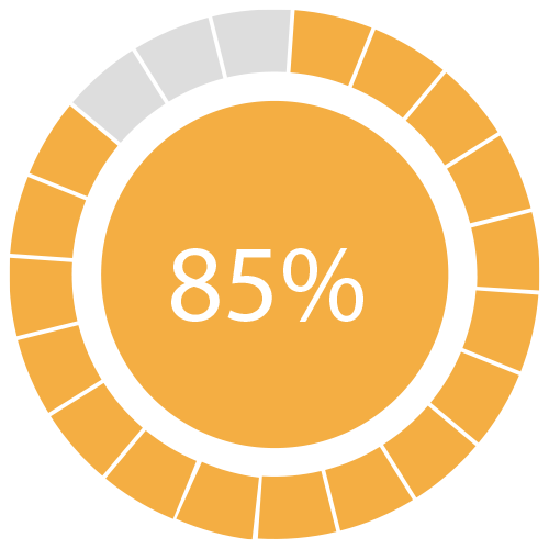
85 percent of people think that a company's mobile website should be as good as -- or better than -- their desktop website.
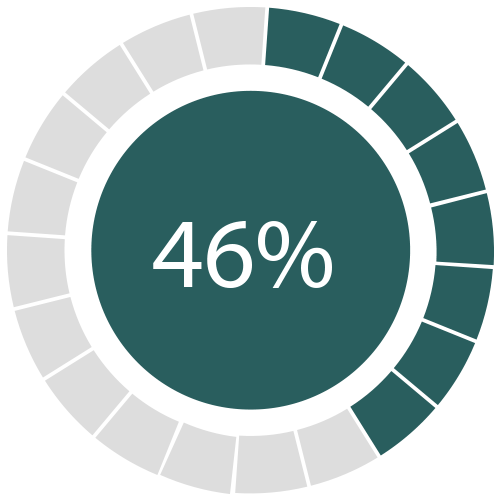
46 percent of people do not return to a web page that doesn't load properly on their mobile device the first time.
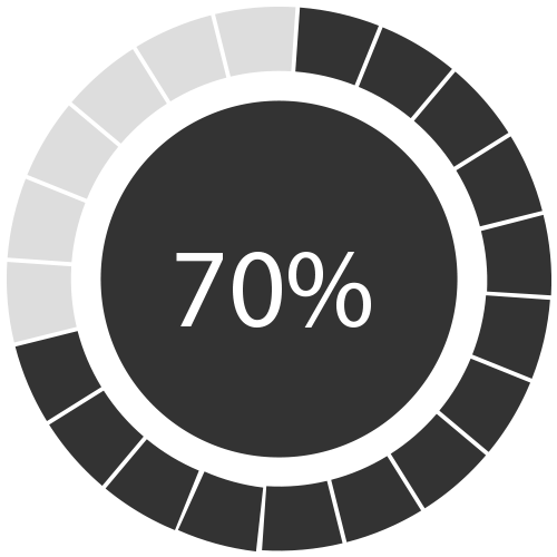
70 percent of Mobile users have outnumbered Desktop users by 3 millions in 2015
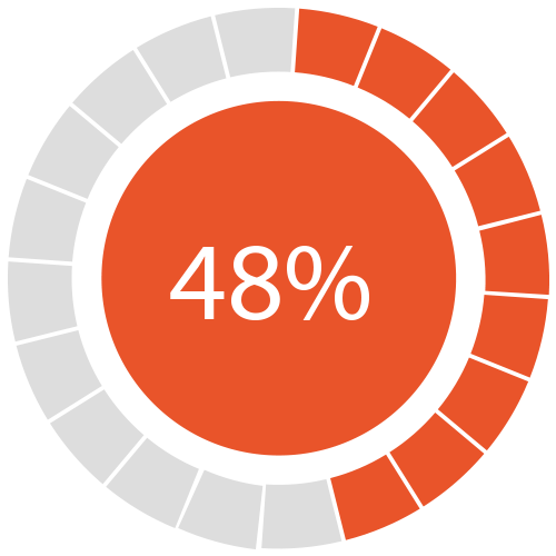
48 percent of users have said that if a website does not work well on their smartphones it makes them feel like the company does not care about their business
